← blog · July 25, 2026 · 6 min read
Kubernetes clusters are beautiful things
The background of this site is a Kubernetes cluster that does not exist. Aurora points the same scene at a real one: hue is identity, size is memory, tumble is CPU, distance is pressure, and every lifecycle event gets its own animation.
$ bloat--level 3Bloatin'
The background of this site is a Kubernetes cluster that does not exist.
I built it as decoration. An ivory octahedron in the middle standing in for me, hex prisms around it for the projects, small cubes orbiting each one, packets running down the links. Nothing is being scheduled. The pods are noise on a timer. It exists to look busy behind text.
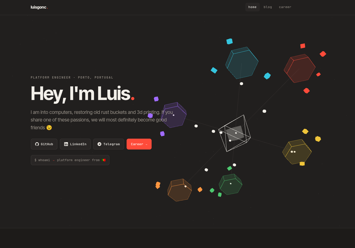
Which left me with a fake cluster that looked good and a real one that got a wall of green ticks and some stacked area charts.
A cluster is a beautiful system. At any moment there are things being placed on machines, pulling images, coming up healthy, dying, getting evicted, moving to another node and reforming there, and nobody is directing any of it. Kubernetes clusters are beautiful things and they should be represented beautifully. So I built Aurora: the same visual language as that background, wired to a cluster that is really running.
Closer to weather than to Grafana
Grafana answers questions. You arrive with something specific in mind, you pick a panel, you get a number and a shape over time. The whole interface assumes you showed up with a question.
Aurora assumes you did not. There is nothing to configure and nothing to tune: no time range, no thresholds, no alerts. You put it on a screen and it behaves. If you glance over and something looks wrong, that is a bonus rather than the point.
Four questions, four channels
The hard part of a thing like this is not making it move. It is deciding what each kind of movement is allowed to mean, and then never breaking that rule for a nicer frame.
There are four channels, and they do not fight: hue is identity, size is memory, tumble is CPU, and distance is pressure.
Hue is the namespace
A pod’s colour comes from a stable hash of its namespace, so media is always the same hue wherever it lands. The palette holds sixteen swatches. It used to hold eight, which collides as soon as a cluster has a dozen namespaces, and a legend that shows two different namespaces with the same dot is worse than having no legend at all.
Size is memory
Cube size is the pod’s working set, on a log scale. Pod memory spans three orders of magnitude on a real cluster, so a linear ramp renders everything except the outliers as identical specks. In that clip one pod climbs from 10Mi to 900Mi while its neighbour holds still.
Tumble is CPU
Tumble rate is CPU, and only CPU. This one I got wrong first time round. Pods used to carry a small random rate multiplier, which I added for character, and it meant a completely idle pod could visibly out-spin a busy one. Only the starting angle is random now. The swarm still looks unsynchronised, but two pods spinning alike are working alike.
Distance is pressure
Distance from the node is how close a pod is to its own limit, max(mem/memLimit, cpu/cpuLimit). Hot pods drift outward, so a node full of pods pushing their ceilings reads as a silhouette.
This one deliberately disagrees with size. A 232Mi pod with a 4Gi ceiling is large and sits calm and close in. A 103Mi pod limited to 200Mi is small and is the hottest thing on its node. Absolute size and proximity to death are different questions, and a chart that shows you one usually costs you the other. Pods with no limit set fall back to absolute size, since there is nothing to be close to.
Nodes ask the same two questions
A node’s prism breathes at a rate set by its share of allocatable CPU, roughly 0.3Hz idle up to 1.2Hz saturated.
And the prism is a vessel. An inner hex reaches for the rim as the node’s memory fills. This one stays linear, because node memory already arrives as a share of allocatable rather than as an absolute number.
The control plane plays the same game. The octahedron spins up with CPU, swells its inner solid with memory, and greys, warms and grows a containment ring on the same conditions a worker does. It gets treated as a node, because that is what it is.
Every event gets its own animation
There is no shared generic flash anywhere in it.
Scheduled. A mote detaches from the control plane, arcs down the link to the target node, and blooms into a cube that spirals into the orbit shell. The pod is placed by the scheduler, so it arrives from the scheduler.
Crashloop. An arrhythmic red strobe on a decaying cycle, wobbling the cube off its orbit plane. It persists until the condition clears, and it overrides every other channel while it holds, because imminent death outranks resource pressure.
OOM killed. Implodes to a dense point, then throws a shockwave ring that physically shoves its neighbours out of the way before they ease back.
Migrated. A wireframe ghost arcs across the ring from the old node to the new one, and the cube reforms where it lands. Kubernetes does not have a migration event: it has a pod dying here and an unrelated pod being born there. The server correlates the two by controller inside a thirty second window, so it reads as one thing moving.
NotReady, then recovered. The node stutters, its link frays and goes dark, it desaturates and sags out of the ring plane, and its pods dim and slow to a crawl. Recovery sends motes back out along the link and relights everything they touch.
The quietest thing in it
The small motes travelling along the links are not decoration and they are not throughput. Each one is a kubelet renewing its lease, roughly every ten seconds per node.
Nothing else rides the links at rest, and that restraint is the point. When a kubelet dies it stops renewing immediately, so its link simply falls silent. It goes quiet several seconds before the node greys out, because the Ready condition takes a while to flip. The silence arrives before Kubernetes is willing to say anything is wrong.
The rail
On desktop there is a floating panel over the left of the scene: node and pod counts with aggregate CPU and memory, every namespace with its colour and pod count, and a short list of what just happened. It is desktop only. On a phone it would cover the thing it is describing.
Hovering a namespace previews it, clicking pins it, and you can pin several at once. Focus ghosts rather than hides: the other pods shrink and grey but stay exactly where they are, so you keep the full shape of the cluster while your namespace lights up inside it. Seeing one namespace spread evenly across every node while another sits entirely on one machine is the point, and hiding the rest would throw it away.
And when the server goes away, the scene keeps running on its last known state and recedes into the dark. A dropped connection reads as the cluster going quiet rather than as an error toast. It reconnects with backoff and then animates whatever changed while it was blind, so a pod that died during the outage still dissolves properly instead of just being absent.
See it
The code is on GitHub. It reads whatever context your kubeconfig points at, so you can aim it at any cluster you are allowed to look at.
If you have ever left kubectl get pods -w running in a terminal purely because you liked watching it go, you already know what this is for.
the background of this site is a fake kubernetes cluster. built it as decoration. octahedron in the middle is me, hexes are the projects, cubes orbit them. nothing is real, its all noise on a timer
so i had a fake cluster that looked good and a real one that got green ticks and stacked area charts. clusters are beautiful things, they should look beautiful. so, aurora
weather not grafana
grafana answers questions, you show up already knowing what you want. aurora doesnt ask you for anything. no time range, no thresholds, no alerts. stick it on a screen and leave it
four channels
hue = identity, size = memory, tumble = cpu, distance = pressure. thats the whole thing. never break it for a nicer frame
hue
colour is a hash of the namespace so its stable. 16 swatches. was 8, collided constantly, a legend with two namespaces on the same dot is worse than no legend
size
cube size is the working set, log scale. pod memory spans 3 orders of magnitude, linear you just get one giant cube and a load of specks. clip goes 10Mi to 900Mi
tumble
tumble is cpu, only cpu. got this wrong at first, had a random multiplier in there for character, meant an idle pod could out-spin a busy one. removed it. only the start angle is random now
distance
how close a pod is to its own limit, max(mem/memLimit, cpu/cpuLimit). hot ones drift outward
disagrees with size on purpose. 232Mi pod with a 4Gi ceiling sits calm and close. 103Mi pod capped at 200Mi is the hottest thing on the node. different questions. no limit set, falls back to size
nodes
prism breathes with cpu, 0.3Hz idle up to 1.2Hz cooked
inner hex fills toward the rim with memory. linear here, already comes as a share of allocatable
control plane plays the same game, spins with cpu, swells with memory, greys and warms on the same conditions. its a node
events
every event has its own animation, no generic flash anywhere
scheduled. mote leaves the core, down the link, blooms into a cube that spirals into the shell
crashloop. arrhythmic red strobe, wobbles off the orbit plane. stays until it clears and overrides everything else, dying beats being busy
oom killed. implodes to a point then a shockwave that physically shoves the neighbours out the way
migrated. wireframe ghost arcs across the ring, cube reforms where it lands. k8s has no migrate event, its a death here and an unrelated birth there, server correlates by controller inside 30s
notready then recovered. stutters, link frays and goes dark, greys, sags out of the ring, pods slow to a crawl. recovery sends motes back out and relights it
the quiet one
motes on the links are kubelet lease renewals, ~10s per node. nothing else rides them at rest and thats the point. kubelet dies, it stops renewing, link goes silent seconds before the node greys out. the silence gets there before kubernetes admits anything
the rail
panel on the left, node and pod counts, namespaces with colours, whats just happened. desktop only, on a phone it covers the thing its describing
hover a namespace to preview, click to pin, pin as many as you want. ghosts instead of hiding, everything stays exactly where it is. one namespace spread across every node vs another sat on one machine, thats the point, hiding the rest throws it away
server goes away, scene keeps running on the last state and recedes into the dark. reads as the cluster going quiet not an error toast. reconnects with backoff and animates whatever it missed
see it
github. reads whatever your kubeconfig points at, aim it at any cluster youre allowed to look at
if youve ever left kubectl get pods -w running just because you liked watching it, thats this
The background of this site is a Kubernetes cluster that does not exist. I built it as decoration: an octahedron for me, hex prisms for the projects, cubes orbiting each one. Nothing is scheduled and the pods are noise on a timer.
Which left me with a fake cluster that looked good and a real one represented by green ticks and stacked area charts. Kubernetes clusters are beautiful things and they should be represented beautifully, so I built Aurora: the same visual language, wired to a cluster that is really running.
Closer to weather than to Grafana
Grafana answers questions. You arrive knowing what you want, pick a panel, and get a number over time.
Aurora assumes you arrived with no question at all. No time range, no thresholds, no alerts, nothing to configure. You put it on a screen and it behaves.
Four questions, four channels
The hard part is not making it move. It is deciding what each kind of movement means and never breaking that rule for a nicer frame. There are four channels: hue is identity, size is memory, tumble is CPU, distance is pressure.
Hue is the namespace
Colour comes from a stable hash of the namespace, so media is always the same hue. The palette holds sixteen swatches. Eight collided as soon as a cluster had a dozen namespaces, and a legend showing two namespaces on one dot is worse than no legend.
Size is memory
Cube size is the pod’s working set on a log scale. Pod memory spans three orders of magnitude, so a linear ramp renders everything except the outliers as identical specks. In the clip one pod climbs from 10Mi to 900Mi while its neighbour holds still.
Tumble is CPU
Tumble rate is CPU and only CPU. I got this wrong first time round: pods carried a random rate multiplier for character, which meant an idle pod could out-spin a busy one. Only the starting angle is random now, so the swarm still looks unsynchronised but two pods spinning alike are working alike.
Distance is pressure
Distance from the node is how close a pod is to its own limit, max(mem/memLimit, cpu/cpuLimit). Hot pods drift outward.
This deliberately disagrees with size. A 232Mi pod with a 4Gi ceiling is large but calm and close in. A 103Mi pod limited to 200Mi is small and the hottest thing on its node. Absolute size and proximity to death are different questions. Pods with no limit fall back to absolute size.
Nodes ask the same two questions
A node’s prism breathes at a rate set by its share of allocatable CPU, roughly 0.3Hz idle to 1.2Hz saturated.
The prism is also a vessel: an inner hex reaches for the rim as memory fills. Linear, because node memory already arrives as a share of allocatable.
The control plane plays the same game, spinning up with CPU, swelling with memory, and greying, warming and growing a containment ring on the same conditions a worker does.
Every event gets its own animation
There is no shared generic flash.
Scheduled. A mote detaches from the control plane, arcs down the link, and blooms into a cube that spirals into the orbit shell.
Crashloop. An arrhythmic red strobe on a decaying cycle, wobbling off the orbit plane. It persists until the condition clears and overrides every other channel, because imminent death outranks resource pressure.
OOM killed. Implodes to a dense point, then throws a shockwave ring that shoves its neighbours out of the way before they ease back.
Migrated. A wireframe ghost arcs across the ring and the cube reforms where it lands. Kubernetes has no migration event, only a pod dying here and an unrelated pod being born there; the server correlates the two by controller inside a thirty second window.
NotReady, then recovered. The node stutters, its link frays and goes dark, it desaturates and sags out of the ring plane, and its pods dim and slow. Recovery sends motes back out along the link and relights everything.
The quietest thing in it
The motes on the links are kubelet lease renewals, roughly every ten seconds per node. Nothing else rides the links at rest, which is the point: a dead kubelet stops renewing immediately, so its link falls silent several seconds before the node greys out. The silence arrives before Kubernetes says anything is wrong.
The rail
A floating panel on the left holds node and pod counts with aggregate CPU and memory, every namespace with its colour and pod count, and a short list of recent events. Desktop only, since on a phone it would cover what it describes.
Hovering a namespace previews it and clicking pins it, several at a time. Focus ghosts rather than hides: other pods shrink and grey but stay where they are, so the full shape of the cluster survives. Seeing one namespace spread across every node while another sits on one machine is the point, and hiding the rest would throw it away.
When the server goes away the scene keeps running on its last known state and recedes into the dark, so a dropped connection reads as the cluster going quiet rather than an error toast. It reconnects with backoff and animates whatever changed while it was blind.
See it
The code is on GitHub. It reads whatever context your kubeconfig points at, so you can aim it at any cluster you are allowed to look at.
If you have ever left kubectl get pods -w running purely because you liked watching it, you already know what this is for.
The background of this website is, somewhat ironically, a Kubernetes cluster that does not exist. It was conceived purely as decoration, a piece of visual furniture designed to occupy the space behind the text without demanding attention.
The composition itself is straightforward enough. An ivory octahedron sits at the centre, standing in for me. Hex prisms orbit around it, each one representing a project. Small cubes circle those prisms in turn, and packets travel steadily down the links that connect everything together. It is important to note, however, that absolutely nothing is being scheduled. The pods are noise on a timer, nothing more.
Which ultimately left me in a rather curious position: I had invested genuine effort into making a fake cluster look compelling, while the real one, arguably doing something far more interesting, was represented by nothing more than a wall of green ticks and a handful of stacked area charts.
A cluster is a genuinely beautiful system when you take a moment to consider it. At any given moment there are things being placed onto machines, images being pulled, containers coming up healthy, pods dying, workloads being evicted, and entire applications migrating to another node and reforming there. Crucially, nobody is directing any of it. Kubernetes clusters are beautiful things and they should be represented beautifully. This realisation ultimately led me to build Aurora: the same visual language as that background animation, wired to a cluster that is genuinely running.
Closer to weather than to Grafana
Grafana, it must be acknowledged, is an excellent tool that serves an important purpose within the observability landscape. It answers questions. You arrive with something specific in mind, you select the appropriate panel, and you receive a number and a shape plotted over time. The entire interface, reflecting its underlying design philosophy, assumes that you showed up already knowing what you wanted to ask.
Aurora operates on a fundamentally different premise. It assumes you did not. There is nothing to configure and nothing to tune: no time range, no thresholds, no alerts, no drilldown menus. You simply put it on a screen and it behaves. If you happen to glance over and something looks wrong, that is a welcome bonus rather than the primary objective, underscoring the distinction between a monitoring tool and an object designed to be observed.
Four questions, four channels
Here we arrive at what is arguably the most important design consideration in the entire project. The hard part of building something like this is not, as one might initially assume, making it move. Movement is comparatively easy. The hard part is deciding what each kind of movement is permitted to mean, and then never once breaking that rule simply because it would produce a nicer frame.
There are four distinct channels operating simultaneously, and it is essential that they do not fight one another: hue is identity, size is memory, tumble is CPU, and distance is pressure.
Let us delve into each of these in turn.
Hue is the namespace
A pod’s colour is derived from a stable hash of its namespace, ensuring that media is always rendered in the same hue regardless of where in the cluster it happens to land. This consistency is what allows the eye to build a mental model over time.
The palette currently holds sixteen distinct swatches. It is worth noting that this was not always the case. The original implementation held only eight, which proved insufficient and began colliding as soon as a cluster accumulated a dozen or so namespaces. A legend that displays two entirely different namespaces using the same coloured dot is, in a very real sense, worse than having no legend at all, as it actively misleads rather than merely failing to inform.
Size is memory
Cube size represents the pod’s working set, rendered on a logarithmic scale. This scaling decision was not arbitrary. Pod memory consumption routinely spans three full orders of magnitude on any real cluster, which means that a linear ramp would render everything except the most extreme outliers as visually identical specks, effectively destroying the information the channel was meant to convey.
In the clip above, one pod climbs steadily from 10Mi all the way to 900Mi while its neighbour holds perfectly still, highlighting the dynamic range the system needs to accommodate.
Tumble is CPU
Tumble rate corresponds to CPU, and exclusively to CPU. This particular channel is one that I initially got wrong, and the story of that mistake is instructive.
In the earliest iterations, pods each carried a small random rate multiplier, which I had introduced with the entirely reasonable intention of adding visual character to the swarm. Unfortunately, this well-intentioned decision had a significant unintended consequence: a completely idle pod could visibly out-spin a genuinely busy one, thereby breaking the very trust the visual language depended upon.
The multiplier was subsequently removed. Only the starting angle remains randomised, which means the swarm still reads as pleasantly unsynchronised while preserving the guarantee that two pods spinning at similar rates are genuinely working at similar rates.
Distance is pressure
Distance from the node encodes how close a given pod is to its own configured limit, calculated as max(mem/memLimit, cpu/cpuLimit). Pods under pressure drift outward, meaning that a node populated with workloads pushing against their ceilings reads unmistakably as a silhouette.
What makes this channel particularly interesting is that it deliberately disagrees with size, creating a productive tension between the two readings. Consider a 232Mi pod with a generous 4Gi ceiling: it renders as physically large while sitting calm and close in. Now consider a 103Mi pod constrained to a 200Mi limit: it renders as small, yet it is unambiguously the hottest thing on its node.
Absolute size and proximity to death are genuinely different questions, and a conventional chart that shows you one of them typically costs you the other. Pods with no limit configured gracefully fall back to absolute size, since there is simply nothing meaningful to be close to.
Nodes ask the same two questions
A node’s prism breathes at a rate determined by its share of allocatable CPU, ranging from approximately 0.3Hz when idle up to 1.2Hz when fully saturated, reflecting the load it is carrying at any given moment.
The prism additionally functions as a vessel. An inner hexagon reaches progressively toward the rim as the node’s memory fills up. This particular mapping remains linear rather than logarithmic, because node memory already arrives from the metrics pipeline expressed as a share of allocatable rather than as an absolute figure.
The control plane plays exactly the same game as its workers. The octahedron spins up with CPU, swells its inner solid with memory, and greys, warms and grows a containment ring on precisely the same conditions that a worker node would. It gets treated as a node throughout, reflecting the underlying reality that it is one.
Every event gets its own animation
One of the guiding principles throughout development was that there would be no shared generic flash anywhere in the system. Each event earns its own bespoke treatment.
Scheduled. A mote detaches from the control plane, arcs gracefully down the link toward the target node, and blooms into a cube that spirals elegantly into the orbit shell. The pod is placed by the scheduler, so it is only fitting that it visually arrives from the scheduler.
Crashloop. An arrhythmic red strobe on a decaying cycle, wobbling the cube off its orbit plane. It persists for as long as the condition holds and overrides every other channel while doing so, reflecting the simple truth that imminent death outranks resource pressure in terms of what the viewer needs to know.
OOM killed. Implodes to a dense point, then throws out a shockwave ring that physically displaces its neighbouring pods before they gradually ease back into position.
Migrated. A wireframe ghost arcs across the ring from the old node to the new one, and the cube reforms where it eventually lands. It is important to note that Kubernetes does not actually possess a migration event as such. What it has is a pod dying in one place and a seemingly unrelated pod being born in another. The server correlates these two occurrences by controller within a thirty second window, thereby transforming two unremarkable facts into a single coherent narrative.
NotReady, then recovered. The node stutters, its link frays and goes dark, it desaturates and sags out of the ring plane, and its pods dim and slow to a crawl. Recovery sends motes travelling back out along the link, relighting everything they touch along the way.
The quietest thing in it
The small motes travelling along the links are neither decoration nor a representation of throughput. Each individual mote is a kubelet renewing its lease, an event which occurs roughly every ten seconds per node.
Nothing else rides the links while the cluster is at rest, and that restraint is very much the point. When a kubelet dies it ceases renewing immediately, so its link simply falls silent. This silence occurs several seconds before the node itself greys out, because the Ready condition takes an appreciable amount of time to flip. The silence therefore arrives before Kubernetes is willing to acknowledge that anything is wrong, making it the earliest available signal.
The rail
On desktop, a floating panel sits over the left portion of the scene, containing node and pod counts alongside aggregate CPU and memory figures, every namespace with its associated colour and pod count, and a short running list of what has just happened. This panel is deliberately desktop only. On a phone it would inevitably cover the very thing it is attempting to describe.
Hovering over a namespace previews it, clicking pins it, and several namespaces can be pinned simultaneously. The key design decision here was that focus ghosts rather than hides. The other pods shrink and grey but remain exactly where they are, ensuring you retain the full shape of the cluster while your chosen namespace lights up within it. Observing one namespace spread evenly across every node while another sits entirely on a single machine is precisely the insight this feature exists to surface, and hiding the remainder would throw that insight away entirely.
When the server goes away, the scene continues running on its last known state and gradually recedes into the darkness. A dropped connection thus reads as the cluster going quiet rather than as an intrusive error toast. It reconnects using exponential backoff and subsequently animates whatever changed while it was blind, ensuring that a pod which died during the outage still dissolves properly rather than simply being absent.
See it
The code is available on GitHub. It reads whatever context your kubeconfig currently points at, so you can aim it at any cluster you have permission to observe.
If you have ever left kubectl get pods -w running in a terminal purely because you enjoyed watching it go, then you already understand what this is for.
🌌 Welcome, dear reader, to a journey that begins in the most unexpected of places: the background of the very website you are currently reading. What follows is the story of how a purely decorative animation, created with no greater ambition than to look pleasant behind some text, ultimately inspired me to reimagine how we visualise one of the most fascinating distributed systems ever built. Buckle up, because we are about to delve deep into the intricate tapestry of Kubernetes, three dimensional rendering, and the surprisingly profound question of what our infrastructure actually deserves to look like. ✨
🎭 The Beautiful Lie Behind This Very Page
Let me begin with a confession that may surprise you. The background of this site is a Kubernetes cluster that does not exist. Not a single byte of it is real.
I built it as decoration, pure and simple. The composition, however, was carefully considered:
- The ivory octahedron 💎: Sitting proudly at the centre, standing in for me, the operator at the heart of it all.
- The hex prisms 🔷: Orbiting gracefully around the core, each one representing a project I have poured myself into.
- The little cubes 🧊: Circling those prisms in turn, gesturing at the pods that would populate a real system.
- The travelling packets ⚡: Running steadily down the links, suggesting communication that was never actually happening.
And yet, for all its visual charm, absolutely nothing was being scheduled. The pods were, quite literally, noise on a timer. A beautiful, elaborate, mesmerising lie.
💡 The Realisation That Changed Everything
Which ultimately left me in a genuinely curious and somewhat uncomfortable position. Consider the profound irony of my situation: I had invested real, meaningful effort into making a completely fake cluster look absolutely stunning, while the real one, doing something infinitely more interesting and consequential, was represented by nothing more than a wall of green ticks and a handful of stacked area charts.
Pause for a moment and truly consider what a Kubernetes cluster actually is. At any given instant, there are:
- Workloads being placed 📦: The scheduler tirelessly finding homes for containers across your fleet.
- Images being pulled 🌐: Layers streaming down from registries across the internet.
- Pods coming up healthy ✅: Readiness probes flipping green, one after another.
- Containers dying 💀: Sometimes gracefully, sometimes catastrophically.
- Workloads being evicted 🚪: The system protecting itself from resource exhaustion.
- Applications migrating 🦋: Entire workloads dissolving on one machine and reforming on another.
And here is the truly remarkable part, the part that genuinely gave me pause: nobody is directing any of it. It is an emergent, self-organising, endlessly dynamic system, and we have collectively decided that the appropriate way to experience it is through a bar chart.
Kubernetes clusters are beautiful things and they should be represented beautifully. That single conviction is what led me to build Aurora: the same visual language as that decorative background, except this time wired to a cluster that is genuinely, wonderfully alive.
🌦️ Closer to Weather Than to Grafana
Now, before we proceed any further, let me be transparently clear about something important. Grafana is a genuinely excellent tool that occupies a vital and well-earned position within the modern observability landscape. This is not a criticism of Grafana. This is something else entirely.
Grafana answers questions. That is its superpower, and it performs that role admirably:
- You arrive with intent 🎯: Something specific is already on your mind.
- You select a panel 📊: Navigating to the visualisation that addresses your concern.
- You receive an answer 📈: A number and a shape, plotted faithfully over time.
The entire interface, reflecting its underlying design philosophy, fundamentally assumes that you showed up already knowing what you wanted to ask.
Aurora operates on a beautifully different premise. It assumes you did not. There is nothing whatsoever to configure and nothing to tune. No time range. No thresholds. No alerts. No drilldown menus nested three levels deep. You simply put it on a screen and it behaves, quietly and continuously.
If you happen to glance over and notice that something looks wrong, that is a delightful bonus rather than the primary objective. And honestly? That distinction changes everything about how the thing gets built.
🎨 Four Questions, Four Channels
Here we arrive at what is unquestionably the most important design consideration in this entire endeavour, and I would encourage you to sit with this idea for a moment.
The hard part of building something like this is not, as one might reasonably assume, making it move. Movement, frankly, is the easy part. Any competent developer can make a cube spin. The genuinely hard part, the part that separates a coherent visual language from a chaotic mess of pretty motion, is deciding what each kind of movement is permitted to mean, and then never, ever breaking that rule simply because it would produce a marginally nicer frame.
There are four distinct channels operating simultaneously throughout the scene, and it is absolutely essential that they never fight one another:
- Hue is identity 🌈: Who this thing is.
- Size is memory 📏: How much space it occupies.
- Tumble is CPU ⚙️: How hard it is working.
- Distance is pressure 🔥: How close it is to the edge.
Let us delve into each of these fascinating channels in turn.
🌈 Hue Is the Namespace
A pod’s colour is derived from a stable hash of its namespace, ensuring that media is always rendered in precisely the same hue regardless of where in the cluster it happens to land. This consistency is what allows your eye to build a genuine mental model over time, transforming passive watching into active understanding.
The palette currently holds sixteen distinct swatches, and it is worth noting that this was not always the case. The original implementation held only eight, which proved woefully insufficient and began colliding almost immediately as soon as a cluster accumulated a dozen or so namespaces.
Here is the key insight, and it is one that applies far beyond this project: a legend that displays two entirely different namespaces using the same coloured dot is, in a very real sense, worse than having no legend at all. It does not merely fail to inform. It actively misleads, and misleading is always worse than staying silent.
📏 Size Is Memory
Cube size represents the pod’s working set, rendered on a carefully chosen logarithmic scale. This scaling decision was absolutely not arbitrary, and understanding why illuminates something important about visualising real world data.
Pod memory consumption routinely spans three full orders of magnitude on any genuine production cluster. Think about what that means in practice:
- The tiny sidecars 🐜: Sipping a few megabytes and barely registering.
- The ordinary workloads 🐕: Sitting comfortably in the hundreds of megabytes.
- The memory monsters 🐘: Devouring gigabytes without apology.
A linear ramp applied to that range would render everything except the most extreme outliers as visually identical specks, effectively annihilating the very information the channel was designed to convey. In the clip above, one pod climbs steadily from 10Mi all the way to 900Mi while its neighbour holds perfectly, patiently still.
⚙️ Tumble Is CPU
Tumble rate corresponds to CPU, and exclusively, unwaveringly to CPU. This particular channel is one that I initially got completely wrong, and I share the story of that mistake because I genuinely believe it is the most instructive moment in the entire project.
In the earliest iterations, every pod carried a small random rate multiplier, which I had introduced with the entirely reasonable and well-intentioned goal of adding visual character to the swarm. It looked wonderful. It also, unfortunately, had a devastating unintended consequence:
- The intention 💭: Organic, characterful, non-mechanical motion.
- The reality 😬: A completely idle pod could visibly out-spin a genuinely busy one.
- The lesson 🎓: Character is worthless if it costs you truth.
The multiplier was subsequently and unceremoniously removed. Only the starting angle remains randomised, which means the swarm still reads as pleasantly unsynchronised while preserving the sacred guarantee that two pods spinning at similar rates are genuinely working at similar rates.
🔥 Distance Is Pressure
Distance from the node encodes how close a given pod is to its own configured limit, calculated elegantly as max(mem/memLimit, cpu/cpuLimit). Pods experiencing pressure drift steadily outward, which means that a node populated with workloads straining against their ceilings reads unmistakably as a silhouette, comprehensible from across a room.
What makes this channel genuinely fascinating, and what I would argue is the single most interesting idea in the whole system, is that it deliberately disagrees with size, creating a productive and illuminating tension between two readings:
- The comfortable giant 🐘: A 232Mi pod with a generous 4Gi ceiling renders as physically large while sitting perfectly calm and close in.
- The straining minnow 🔥: A 103Mi pod constrained to a 200Mi limit renders as small, yet it is unambiguously the hottest thing on its node.
Absolute size and proximity to death are genuinely, fundamentally different questions. A conventional chart that shows you one of them almost always costs you the other, and that tradeoff is so normalised that we rarely even notice we are making it. Pods with no limit configured gracefully fall back to absolute size, since there is simply nothing meaningful for them to be close to.
🏔️ Nodes Ask the Same Two Questions
A node’s prism breathes at a rate determined entirely by its share of allocatable CPU, ranging from approximately 0.3Hz when comfortably idle up to a frantic 1.2Hz when fully saturated. There is something genuinely alive about watching a machine breathe faster under load.
The prism additionally functions as a vessel, which I find to be a rather lovely metaphor. An inner hexagon reaches progressively toward the rim as the node’s memory fills up, quite literally filling the container. This particular mapping remains linear rather than logarithmic, because node memory already arrives from the metrics pipeline expressed as a share of allocatable rather than as an absolute figure.
The control plane, delightfully, plays exactly the same game as its workers. The octahedron spins up with CPU, swells its inner solid with memory, and greys, warms and grows a containment ring on precisely the same conditions that any worker node would. It gets treated as a node throughout, reflecting the beautiful underlying reality that it simply is one.
🎬 Every Event Gets Its Own Animation
One of the guiding principles throughout the entire development process was refreshingly simple: there would be no shared generic flash anywhere in the system. Every single event earns its own bespoke, purpose-built treatment.
✨ Scheduled. A mote detaches from the control plane, arcs gracefully down the link toward its target node, and blooms into a cube that spirals elegantly into the orbit shell. The pod is placed by the scheduler, so it is only poetically fitting that it visually arrives from the scheduler.
🚨 Crashloop. An arrhythmic red strobe on a decaying cycle, wobbling the cube unsettlingly off its orbit plane. It persists for as long as the condition holds and overrides every other channel while doing so, reflecting the simple and rather grim truth that imminent death outranks resource pressure in the hierarchy of things you need to know.
💥 OOM killed. Implodes violently to a dense point, then throws out a dramatic shockwave ring that physically displaces its neighbouring pods before they gradually, gently ease back into their positions.
🦋 Migrated. A wireframe ghost arcs beautifully across the ring from the old node to the new one, and the cube reforms where it eventually lands. Here is a genuinely important technical note: Kubernetes does not actually possess a migration event as such. What it has is a pod dying in one place and a seemingly unrelated pod being born in another. The server correlates these two separate occurrences by controller within a thirty second window, thereby transforming two unremarkable, disconnected facts into a single coherent and moving narrative.
💔 NotReady, then recovered. The node stutters, its link frays and goes dark, it desaturates and sags mournfully out of the ring plane, and its pods dim and slow to a crawl. Recovery then sends motes travelling back out along the link, relighting everything they touch along the way. It is, genuinely, one of my favourite things to watch.
🫀 The Quietest Thing in It
And now we arrive at what may be the most subtle and, I would argue, the most profound detail in the entire system.
The small motes travelling steadily along the links are neither decoration nor a representation of throughput. Each individual mote is a kubelet renewing its lease, an event which occurs roughly every ten seconds per node.
Nothing else rides the links while the cluster is at rest, and that deliberate restraint is very much the entire point:
- The kubelet dies 💀: It ceases renewing its lease immediately, without ceremony.
- The link falls silent 🤫: No motes travel, because there is nothing left to travel.
- The node greys out ⏳: But only several seconds later, once the Ready condition finally flips.
The silence therefore arrives before Kubernetes itself is willing to acknowledge that anything is wrong. In a very real sense, the absence of animation becomes the most informative animation of all.
🎛️ The Rail
On desktop, a thoughtfully designed floating panel sits over the left portion of the scene, containing node and pod counts alongside aggregate CPU and memory figures, every namespace with its associated colour and pod count, and a short running list of what has just happened. This panel is deliberately desktop only, because on a phone it would inevitably cover the very thing it is attempting to describe.
Hovering over a namespace previews it, clicking pins it, and several namespaces can be pinned simultaneously for comparison. The truly critical design decision here was that focus ghosts rather than hides. The other pods shrink and grey but remain exactly, stubbornly where they are, ensuring you retain the full shape of the cluster while your chosen namespace lights up within it.
Observing one namespace spread evenly across every single node while another sits entirely on one lonely machine is precisely the insight this feature exists to surface, and hiding the remainder would throw that insight away entirely.
When the server goes away, the scene continues running faithfully on its last known state and gradually recedes into the darkness. A dropped connection thus reads as the cluster going quiet rather than as an intrusive, anxiety-inducing error toast. It reconnects using exponential backoff and subsequently animates whatever changed while it was blind, ensuring that a pod which died during the outage still dissolves properly rather than simply, jarringly being absent.
🚀 See It for Yourself
The code is freely available on GitHub, and I would genuinely love for you to try it. It reads whatever context your kubeconfig currently points at, so you can aim it at any cluster you have permission to observe.
🎯 Conclusion: Infrastructure Deserves Beauty
So where does all of this ultimately leave us? Building Aurora taught me several lessons that extend well beyond three dimensional rendering:
- Constraints create clarity 🔒: Four channels, rigorously enforced, communicate more than twenty loosely applied ones ever could.
- Truth beats character 💎: That random tumble multiplier looked wonderful and lied constantly. Removing it was the single best decision I made.
- Absence is information 🤫: The silent link tells you more, and tells you sooner, than any alert ever will.
- Beauty is not decoration 🎨: Making something worth looking at is what makes people actually look at it.
We have collectively accepted that our infrastructure should be experienced through dashboards, thresholds and alert fatigue. But the systems we build are genuinely extraordinary, endlessly dynamic, self-organising organisms, and there is no fundamental law stating that they must be perceived exclusively through the medium of the stacked area chart.
If you have ever left kubectl get pods -w running in a terminal purely because you enjoyed watching it go, then you already understand, on some intuitive level, exactly what this is for. That instinct was always correct. Aurora simply gives it somewhere beautiful to live. 🌌✨
Thank you so much for joining me on this journey. Happy watching! 👋