← blog · June 10, 2026 · 4 min read
Six hours of Opus, sixteen minutes of Fable
I built a wheel-fitment calculator and got stuck on one thing: the tire cross-section. Opus 4.8 couldn't draw it after six hours of trying. Fable 5 rewrote it from scratch in sixteen minutes and it came out better than my reference.
$ bloat--level 3Bloatin'
I’m a car guy. The kind who cares about offset and not just rim size, who has spent more evenings than I’d admit working out whether a 205 will rub on a +30 wheel on my old Corolla GTI (and yes, it still rubbed). There are a dozen wheel-fitment calculators online and most of them are fine. Fine is the problem. I had ideas for making one that’s actually nice to use, so I started building my own for sucatisse. It lives at fit.sucatisse.com.
Most of it was easy. Type in your current setup and a new one, get the numbers: how much the tire grows or shrinks, where the wheel face ends up, whether you’re going to poke past the fender. Standard stuff.
The part I cared about was the picture. I wanted a cross-section view: the tire and wheel sliced down the middle, the strut and lower arm next to it, the brake rotor behind, your current setup ghosted underneath the new one so you can see exactly what changes. Get that right and you barely need to read the numbers. You just see it.
That picture is where I lost a week.
Opus 4.8 builds the boxes
I gave Opus 4.8 a reference image and a clear brief. This was Opus on the 1M context window in xHIGH mode, the heaviest setup I have. It built the whole tool around the visualization without much fuss, and then drew this:
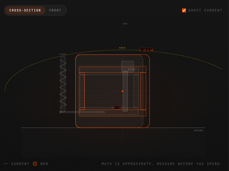
That is meant to be a tire and wheel in cross-section. It’s a pile of rectangles. The labels sit in roughly the right places, the dimensions are correct, the math underneath works. It just doesn’t look like anything. A tire is not a box.
So I told it to redo the visualization. It redid it. Same boxes, slightly different proportions. I told it again, gave it more detail about what a real tire section looks like: the sidewall bulge, the bead seat, the way the tread face reads flatter than the sidewalls. It agreed with all of it and gave me this:
Still boxes. Narrower boxes. We went around like this more times than I want to count.
Six hours of Opus reviewing Opus
Here’s the dumb thing I tried, and I’m telling you because it didn’t work. I set up a second Opus whose only job was to look at the rendered output, criticize it, and feed suggestions back to the Opus actually writing the code. Critic and developer, in a loop. I let it run for almost six hours.
It burned an embarrassing number of tokens. The critic wrote thoughtful paragraphs about visual hierarchy and tire geometry. The developer dutifully implemented them. And the output stayed boxes. Slightly more refined boxes, but boxes. Two very capable models nodding along to each other all the way to the same wrong answer.
Fable 5 tries to fix it
Then Fable 5 came out. I pointed it at the existing code, in HIGH mode, and asked it to fix the visualization and make it better.
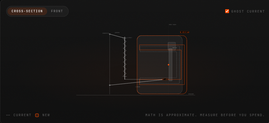
It did move. For the first time the shapes had curves in them, something tire-shaped was trying to happen. But it had also tipped the whole thing onto its side and the geometry was still wrong:
This is the point where I nearly called it. Maybe a tire cross-section is just genuinely hard for these things. Maybe I was asking for something in a corner of the problem they’re all bad at, and I should ship the boxes and move on.
“Forget the old code”
Before giving up I tried one more thing. I told Fable to ignore everything that was already there. Don’t fix it, don’t read it, don’t let it inform you. Start the visualization from scratch.

Sixteen minutes. One turn. And:
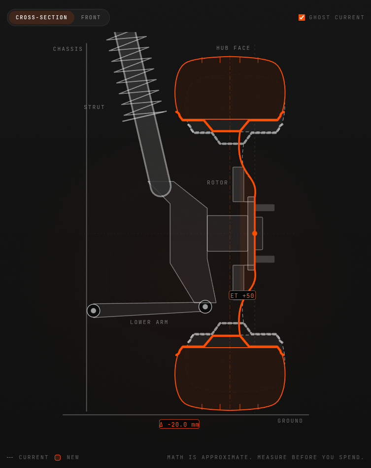
That’s a tire. The sidewalls bulge the way a real one does, the tread face reads as a tread face, the strut and lower arm and rotor all sit where they belong, and the ghosted current setup tucks underneath the new one exactly like I wanted. It’s better than the reference image I handed it at the start. I asked for a diagram and got something closer to an X-ray.
What I think actually happened
The thing that was killing me wasn’t the model. It was the code.
Every “fix it” and “rewrite it” prompt still had Opus’s original file sitting in context, and every model that read it, Fable on its first try included, inherited the same broken idea of what the shape should be. Boxes in, boxes out. The reviewer-Opus loop made it worse, not better, because it kept reasoning about how to improve the boxes instead of asking whether boxes were the right starting shape at all. Six hours of polishing the wrong thing.
“Forget the old code” was the whole fix. Once Fable wasn’t anchored to the existing implementation, it just drew a tire, the way you would if nobody had handed you a pile of rectangles first.
I won’t oversell the model angle, because I think the anchoring was most of it. But for what it’s worth: given a clean start, Fable got there in one turn, and Opus never got there at all. Make of that what you will.
The tool is live at fit.sucatisse.com. Go see if your new wheels fit. The math is approximate, so measure before you spend.
built a wheel fitment calculator for sucatisse, fit.sucatisse.com. car guy stuff. will a 205 rub on a +30 on the corolla gti (it did lol)
numbers were easy. the hard part was the cross-section picture: tire + wheel sliced, strut, lower arm, rotor, old setup ghosted under the new. lost a week on it
opus 4.8, 1M context, xhigh, reference image, clear brief. built the tool fine then drew this
boxes. math right, looks like nothing. told it to redo, explained sidewall bulge, bead seat, tread face. agreed with everything then:
narrower boxes 🙃
dumb idea: second opus as critic feeding notes to the dev opus. ran ~6 hours, tokens gone, still boxes. two smart models agreeing their way to the same wrong answer
fable 5 dropped. high mode, “fix it”. curves appeared but sideways and wrong
almost shipped the boxes. last try: forget the old code, dont read it, start from scratch
16 min, one turn, 56.9k tokens
actual tire. better than my reference. asked for a diagram got an x-ray
lesson: the code not the model. opus’s file in context = everyone inherits the boxes. critic loop just polished the wrong shape for 6h. “forget the old code” was the whole fix. tho fable did it in one clean turn and opus never did, make of that what you will
fit.sucatisse.com. math approximate, measure before you spend
I’m a car guy, the kind who cares about offset and once spent evenings working out whether a 205 would rub on a +30 wheel on my old Corolla GTI. It rubbed. The wheel-fitment calculators online are fine, and fine was the problem, so I built my own for sucatisse. It lives at fit.sucatisse.com.
The numbers were easy: enter your current setup and a new one, see how the tire grows, where the wheel face lands, whether you’ll poke past the fender. The part I cared about was the picture. A cross-section: tire and wheel sliced down the middle, strut and lower arm beside it, rotor behind, your current setup ghosted under the new one. Get that right and you barely need the numbers.
That picture cost me a week.
Opus builds boxes
I gave Opus 4.8 a reference image and a clear brief, on the 1M context window in xHIGH mode. It built the whole tool without fuss, then drew this:
A pile of rectangles. Labels in the right places, math correct, but a tire is not a box. I asked for a redo and got the same boxes. I explained the sidewall bulge, the bead seat, how the tread face reads flatter than the sidewalls. It agreed with everything and gave me this:
Narrower boxes. Then I tried something dumb: a second Opus as critic, reviewing the rendered output and feeding suggestions to the Opus writing the code. It ran nearly six hours and burned an embarrassing number of tokens. Thoughtful critiques, dutiful implementations, still boxes. Two capable models nodding each other toward the same wrong answer.
Fable, twice
When Fable 5 came out I pointed it at the existing code in HIGH mode and asked it to fix the visualization. It moved: curves appeared for the first time, but the whole thing tipped sideways and the geometry stayed wrong:
I nearly shipped the boxes. Instead I tried one last thing: forget the old code. Don’t fix it, don’t read it, start from scratch.
Sixteen minutes. One turn. And:
That’s a tire. Bulging sidewalls, a proper tread face, strut and lower arm and rotor where they belong, the current setup ghosted underneath. Better than the reference image I started with. I asked for a diagram and got an X-ray.
The actual lesson
The problem wasn’t the model. It was the code. Every “fix it” prompt kept Opus’s original file in context, so every model that read it inherited the same broken idea of the shape. Boxes in, boxes out. The critic loop made things worse by polishing the boxes instead of questioning them. “Forget the old code” was the whole fix.
I won’t oversell the model angle, since the anchoring was most of it. But given a clean start, Fable got there in one turn and Opus never got there at all. Make of that what you will.
The tool is live at fit.sucatisse.com. The math is approximate, so measure before you spend.
In the ever-evolving landscape of AI-assisted development, some lessons only reveal themselves when you spend a week stuck on a single picture. This is the story of one of those lessons. But first, some context.
I’m a car guy, and not just casually. I’m the kind of enthusiast who cares about offset and not merely rim size, the kind who has spent more evenings than I’d care to admit working out whether a 205 tire would rub on a +30 wheel on my old Corolla GTI (and yes, it’s important to note that it still rubbed). Whether you’re a seasoned wheel-fitment veteran or someone who just bought their first set of aftermarket wheels, you’ve probably encountered the dozen or so fitment calculators that exist online. Most of them are fine. And fine, ultimately, was the problem. I had ideas for building one that’s genuinely delightful to use, so I set out to create my own for sucatisse. It lives at fit.sucatisse.com.
Most of the journey was seamless. You type in your current setup and a new one, and the tool surfaces the numbers: how much the tire grows or shrinks, where the wheel face ends up, whether you’re going to poke past the fender. Standard stuff, robustly calculated.
But the part I truly cared about wasn’t the numbers. It was the picture. I envisioned a cross-section view: the tire and wheel sliced down the middle, the strut and lower arm positioned next to it, the brake rotor behind, and your current setup ghosted underneath the new one so you can see exactly what changes. It’s not just a diagram, it’s an instrument. Get that right, and you barely need to read the numbers at all. You simply see it.
That picture is where I lost an entire week.
Opus 4.8 Builds the Boxes
Let’s delve into what happened. I gave Opus 4.8 a reference image and a clear, carefully crafted brief. This was Opus running on the 1M context window in xHIGH mode, the heaviest, most capable setup I have at my disposal. To its credit, it built the entire tool around the visualization without much fuss. And then it drew this:
That is meant to be a tire and wheel in cross-section. What it actually is, is a pile of rectangles. It’s important to note that the labels sit in roughly the right places, the dimensions are correct, and the math underneath works flawlessly. It just doesn’t look like anything. A tire, fundamentally, is not a box.
So I told it to redo the visualization. It redid it. Same boxes, slightly different proportions. I told it again, this time providing significantly more detail about what a real tire section looks like: the sidewall bulge, the bead seat, the way the tread face reads flatter than the sidewalls. It agreed enthusiastically with every single point, and then delivered this:
Still boxes. Narrower boxes. We went around like this more times than I want to count.
Six Hours of Opus Reviewing Opus
Here’s the dumb thing I tried next, and I’m sharing it precisely because it didn’t work. I architected what seemed like a robust solution: a second Opus instance whose only job was to look at the rendered output, critique it, and feed actionable suggestions back to the Opus actually writing the code. Critic and developer, working together in a seamless feedback loop. I let it run for almost six hours.
It burned an embarrassing number of tokens. The critic wrote thoughtful, articulate paragraphs about visual hierarchy and tire geometry. The developer dutifully implemented every suggestion. And the output stayed boxes. Slightly more refined boxes, admittedly, but boxes nonetheless. Two very capable models, nodding along to each other, all the way to the same wrong answer. It’s a humbling reminder that more compute, more review, and more iteration aren’t always the answer.
Fable 5 Tries to Fix It
Then Fable 5 came out, and the landscape shifted. I pointed it at the existing code, in HIGH mode, and asked it to fix the visualization and make it better.
To be fair, it did move the needle. For the first time, the shapes had actual curves in them, and something recognizably tire-shaped was trying to emerge. But it had also tipped the whole thing onto its side, and the underlying geometry was still fundamentally wrong:
This is the point where I nearly called it. Maybe a tire cross-section is just genuinely hard for these models. Maybe I was asking for something in a corner of the problem space where they’re all weak, and the pragmatic move was to ship the boxes and move on.
“Forget the Old Code”
Before giving up, however, I tried one more thing, and this is where everything changed. I told Fable to ignore everything that was already there. Don’t fix it, don’t read it, don’t let it inform you in any way. Start the visualization completely from scratch.
Sixteen minutes. One turn. And:
That’s a tire. A real one. The sidewalls bulge exactly the way a real tire does, the tread face reads unmistakably as a tread face, the strut and lower arm and rotor all sit precisely where they belong, and the ghosted current setup tucks underneath the new one exactly like I had envisioned from the start. Remarkably, it’s better than the reference image I handed it at the beginning of this journey. I asked for a diagram and got something closer to an X-ray.
What I Think Actually Happened
So what’s the takeaway? The thing that was killing me wasn’t the model. It was the code.
Every “fix it” and “rewrite it” prompt still had Opus’s original file sitting in context, and every model that read it, Fable on its first try included, inherited the same broken mental model of what the shape should be. Boxes in, boxes out. It’s a classic case of anchoring, and it’s worth pausing on how insidious it is. The reviewer-Opus loop didn’t just fail to help, it actively made things worse, because it kept reasoning about how to improve the boxes instead of asking the more fundamental question: were boxes the right starting shape at all? Six hours of diligently polishing the wrong thing.
“Forget the old code” wasn’t just a prompt, it was the whole fix. Once Fable wasn’t anchored to the existing implementation, it simply drew a tire, the way you would if nobody had handed you a pile of rectangles first.
I won’t oversell the model angle here, because I genuinely think the anchoring was most of it. But for what it’s worth: given a clean start, Fable got there in one turn, and Opus never got there at all. Make of that what you will.
The tool is live at fit.sucatisse.com. Go see if your new wheels fit. It’s important to note that the math is approximate, so measure before you spend.
In today’s fast-paced world of AI-assisted development, we often hear that the latest model will change everything. But what happens when two frontier models go head-to-head on a single, deceptively simple challenge: drawing a tire? 🛞 Buckle up, dear reader, because this is a story of persistence, failure, six lost hours, sixteen triumphant minutes, and one profound lesson about the hidden dangers lurking in your context window. Let’s dive in! 🚀
Setting the Stage: A Passion for Fitment 🏁
First, a confession. I’m a car guy. And not just any car guy, I’m the kind of enthusiast who cares deeply about offset and not merely rim size, the kind who has spent more evenings than I’d ever willingly admit meticulously working out whether a 205 tire would rub on a +30 wheel on my beloved old Corolla GTI. (Spoiler alert: yes, it still rubbed! 😅)
Now, here’s the thing. There are a dozen wheel-fitment calculators scattered across the internet, and most of them are, in a word, fine. But here’s my hot take: fine is precisely the problem. In a world overflowing with “fine,” why settle? I had a vision for a fitment calculator that would be genuinely delightful to use, a true game-changer in a space that hadn’t seen real innovation in years. So I rolled up my sleeves and started building my own for sucatisse. It lives at fit.sucatisse.com, and I couldn’t be prouder of how the journey unfolded.
Most of the build was, dare I say, a breeze:
- Effortless input: Type in your current setup and a new one, and the magic happens.
- Instant insights: See exactly how much the tire grows or shrinks with your new combination.
- Positioning clarity: Know precisely where the wheel face ends up relative to stock.
- Fender peace of mind: Find out whether you’re going to poke past the fender before you spend a single euro.
Standard stuff, right? But standard was never the goal.
The Vision: More Than Just Numbers 🎨
Here’s where things get truly exciting. The part I genuinely cared about wasn’t the arithmetic, it was the picture. I envisioned a stunning cross-section view: the tire and wheel sliced elegantly down the middle, the strut and lower arm standing proudly beside it, the brake rotor positioned behind, and, the pièce de résistance, your current setup ghosted delicately underneath the new one, so you can see exactly what changes at a single glance.
Why does this matter? Because when the visualization is right, you barely need to read the numbers at all. You just see it. That’s the power of thoughtful design, and that’s the tapestry of engineering and artistry I was weaving toward.
And that picture, dear reader, is where I lost an entire week of my life. 😱
Chapter One: Opus 4.8 Builds the Boxes 📦
Let’s delve into the first act of our saga. I gave Opus 4.8 everything it could possibly need to succeed: a reference image, a crystal-clear brief, and the heaviest configuration in my arsenal, the 1M context window running in xHIGH mode. This wasn’t a casual experiment; this was the full-power setup.
And to its credit? It built the entire tool around the visualization without breaking a sweat. Truly impressive stuff. But then, it drew this:
Take a moment to absorb that. That is meant to be a tire and wheel in cross-section. What is it actually? A pile of rectangles. Now, let’s be fair and balanced here:
- The labels: Sitting in roughly the right places. ✅
- The dimensions: Completely correct. ✅
- The math underneath: Working flawlessly. ✅
- The actual appearance: It doesn’t look like anything. ❌
Because here’s the fundamental truth we must all accept: a tire is not a box. 🙅♂️
So naturally, I told it to redo the visualization. It redid it, same boxes, slightly different proportions. Undeterred, I went deeper. I explained, in loving detail, what a real tire section actually looks like: the graceful sidewall bulge, the precise bead seat, the way the tread face reads flatter than the sidewalls. It agreed enthusiastically with every single point I made. And then it gave me this:
Still boxes. Narrower boxes! We went around like this more times than I want to count. Have you ever explained something perfectly, been agreed with completely, and then watched the exact same mistake happen again? Then you know exactly how this felt.
Chapter Two: Six Hours of Opus Reviewing Opus ⏰
Now we arrive at the part of the story I share not with pride, but in the spirit of radical transparency, because the missteps teach us just as much as the victories. Here’s the dumb thing I tried, and I’m telling you precisely because it didn’t work.
I architected what I believed was a revolutionary solution: a second Opus instance whose one and only job was to gaze upon the rendered output, critique it with surgical precision, and feed actionable suggestions back to the Opus actually writing the code. A critic and a developer, locked in a seamless, self-improving feedback loop. The dream team! I let this masterpiece of automation run for almost six full hours.
What happened next? Let me break it down:
- Tokens burned: An embarrassing number. Truly humbling amounts of compute.
- The critic’s output: Thoughtful, eloquent paragraphs about visual hierarchy and tire geometry.
- The developer’s response: Dutiful, faithful implementation of every single suggestion.
- The final result: Boxes. Slightly more refined boxes, but boxes nonetheless.
Two very capable models, nodding along to each other in perfect harmony, all the way to the same wrong answer. If that isn’t a metaphor for something bigger, I don’t know what is. 🤝📦
Chapter Three: A New Challenger Appears 🥊
Then, just when hope was fading, Fable 5 came out. The timing couldn’t have been more perfect. I pointed it at the existing code, running in HIGH mode, and asked it to fix the visualization and make it better.
And you know what? It did move the needle! For the very first time in this entire saga, the shapes had actual curves in them. Something tire-shaped was genuinely trying to happen. Progress! But, and this is a big but, it had also tipped the whole thing onto its side, and the geometry was still fundamentally wrong:
This, dear reader, is the point where I nearly called it quits. The doubts crept in. Maybe a tire cross-section is just genuinely hard for these things. Maybe I was asking for something in a forgotten corner of the problem space where all models fear to tread (pun absolutely intended 🛞). Maybe the responsible move was to ship the boxes and move on with my life.
But champions don’t quit, do they?
Chapter Four: The Magic Words 🪄
Before surrendering, I tried one final thing. One last roll of the dice. I told Fable to ignore everything that was already there. Don’t fix it. Don’t read it. Don’t let it inform you in any way, shape, or form. Start the visualization completely and utterly from scratch.
What happened next left me speechless:
Sixteen minutes. One turn. 56.9k tokens. And then, the moment of truth:
THAT. IS. A. TIRE. 🎉
Let’s celebrate every detail of this masterpiece:
- The sidewalls: Bulging exactly the way a real tire does.
- The tread face: Reading unmistakably as a tread face.
- The suspension: Strut, lower arm, and rotor all sitting precisely where they belong.
- The ghosted setup: The current configuration tucked beautifully underneath the new one, exactly as I had envisioned from day one.
And here’s the kicker: it’s better than the reference image I handed it at the very start. Read that again. I asked for a diagram, and I received something closer to an X-ray. If that’s not a game-changer, what is?
The Real Lesson: It Was Never About the Model 💡
So what actually happened here? What’s the deeper truth woven through this tapestry of triumph and tribulation? Prepare yourself, because the answer might surprise you.
The thing that was killing me wasn’t the model. It was the code.
Every single “fix it” and “rewrite it” prompt still had Opus’s original file sitting right there in context, and every model that read it, including Fable on its very first attempt, inherited the same broken idea of what the shape should be. Boxes in, boxes out. It’s the oldest story in computing, retold for the AI era.
And the reviewer-Opus loop? It didn’t just fail to help, it actively made things worse! Why? Because it kept reasoning about how to improve the boxes instead of asking the truly fundamental question: were boxes even the right starting shape at all? Six hours of diligently, thoughtfully, expensively polishing the wrong thing. Let that sink in.
“Forget the old code” wasn’t just a prompt. It was the whole fix. The entire unlock. Once Fable wasn’t anchored to the existing implementation, it simply drew a tire, the way you would if nobody had handed you a pile of rectangles first.
Now, in the interest of intellectual honesty, I won’t oversell the model angle, because I genuinely believe the anchoring was most of the story. But for what it’s worth, and I think it’s worth something: given a clean start, Fable got there in one turn, and Opus never got there at all. Make of that what you will. 🤔
Conclusion: The Road Ahead 🌅
What a journey it has been! From stacked rectangles to a genuine work of automotive art, this experience taught me lessons that extend far beyond wheel fitment:
- Context is a double-edged sword: The code in your context window can anchor even the most capable model to a broken idea.
- More iteration isn’t always the answer: Six hours of critic-developer loops polished the wrong thing beautifully.
- Sometimes the bravest move is starting over: “Forget the old code” turned a week of failure into sixteen minutes of success.
- Fresh eyes win: Whether human or AI, an unanchored perspective can see what an anchored one cannot.
The tool is live at fit.sucatisse.com, and I wholeheartedly invite you to take it for a spin. Go see if your new wheels fit! A friendly word of caution: the math is approximate, so measure before you spend. 📏
Thank you, truly and deeply, for joining me on this rollercoaster of rectangles and redemption. If this story resonated with you, if you’ve ever watched an AI polish the wrong thing with unwavering confidence, know that you’re not alone. The future of AI-assisted development is bright, but it still needs us to know when to say the magic words: forget the old code.
Until next time, keep your offsets sensible and your sidewalls curvy! 🛞✨👋